IronHacks Fall 2020 Showcase
The pandemic has shifted normal living as we know it, and for our Fall 2020 hack, focused on that. By using granular spatial and temporal data of places of interest in Tippecanoe County, this challenge was to analyze foot traffic in Tippecanoe County to predict what areas will see a higher count.
In cohorts, our participants had the opportunity to learn from their peers and reconstruct their model based on what others were doing. Our Fall 2020 IronHack on COVID-19 had fascinating results from participants who developed insightful models by creatively interpreting granular data supplied to them. Shown here are the top five data visualizations from our Fall 2020 hack.
1st Place Winner Solution
COVID-19 has impacted the social and economic activity of faculty and students at Purdue. The Protect Purdue initiative has implemented a range of measures that keeps classrooms safe. However, the risk outside of the classroom, in bars, restaurants, churches, gyms, grocery stores, etc. remains. Thus, the “social concentration” of people in places in our region creates concerns. An increase in foot traffic* at public places around Purdue, in Tippecanoe County, suggest the normalization of daily routines.
The task here is to build a statistical model using the historical movement, COVID-19 incident and policy intervention data collected from week 11 to week 43 to predict the foot traffic in week 44 for 1804 places of interest (POIs) in Tippecanoe County. Since the time series data given here is short (31 datapoints), using neural networks and attention mechanisms might overfit the data. Hence, I opted for simpler and faster approaches like ARIMA models. Of all the submissions I made, the one with the best performance is of an autoregressive model. That was better than using optimized Random Forest Regressors. This showed that low-level models are capable of handling short time series data better than complex black box models.
The report here shows various visualizations prepared from the given datasets. The objective here is to communicate my analyses and aid the policymakers in their decisions to curb the infection spread.
- foot traffic value here denotes the number of people visit a particular POI in a week.
Heatmap animation showing foot traffic in each POI
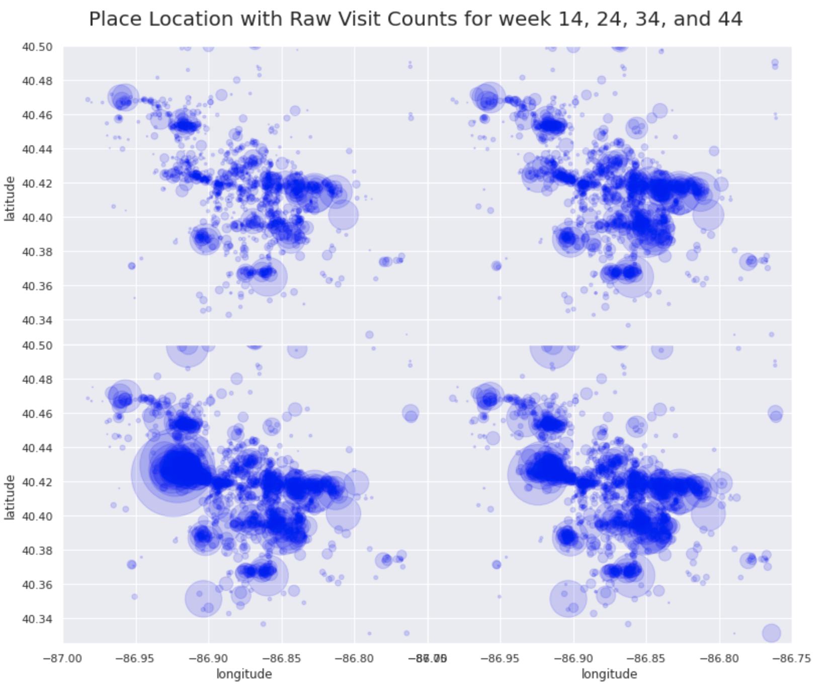
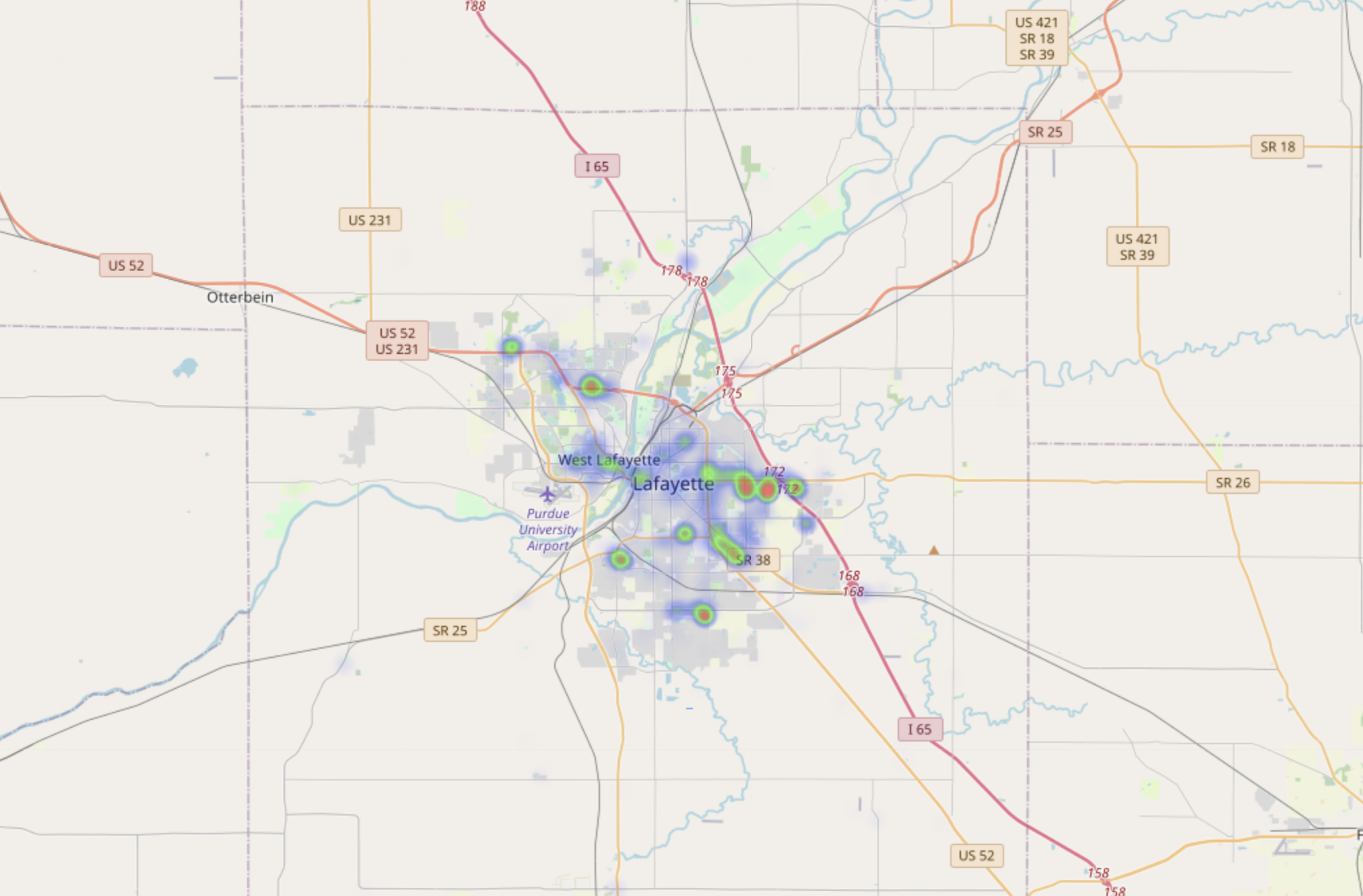 Data shown in heatmap is ‘raw_visit_counts’ data from the challenge dataset, which is the foot traffic at a particular POI. During initial part of lockdowns (week 11 to week 20), we can see that the foot traffic is high in shopping centers and Tippecanoe Mall. Particularly, the two Walmart shopping centers in the west and southwest of the county experience large visit counts. Then it reduces after week 25. After week 33, the foot traffic is starting to increase in Purdue University and prevails until the end of week 43.
Map showing percentage change in foot traffic in each POI
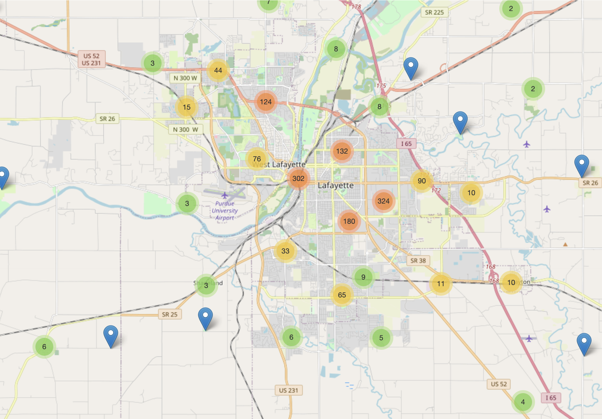 Data shown in this map is the percent change in foot traffic between the last three weeks of the data provided (week 40 to week 43). This is a clustered marker map, meaning the markers that are in proximity are clustered into blobs for visualization purposes. Clicking on the blobs with number will zoom into the area and show the lower level blobs or markers for POI. The percentage change in foot traffic will help us in knowing how the visitors count changed in the last few weeks. If a POI experiences huge positive change in foot traffic, more focus should be put on those POIs.
View the whole notebook for 1’st winner here
2nd Place Winner Solution
During this challenge I tested 13 different models to find the model which was most accurate for predicting the next weeks raw visit count for every POI. Some of these models included regression in the form of linear, ridge, and lasso regression. I found these models to be the least accurate, however, are very simple in that a regression line, or a line of best fit, is drawn through a plot of raw_visit_count over weeks to try to predict for the next week. Although simple, these models should be avoided. Other regression models included KNN regression which is a bit more advanced in that sevaral other variables (such as covid rate, average distance from home, etc) can be applied to try to improve estimates. Time series models such as ARIMA, Exponential Smoothing, and VAR work well with this prediction task because they are naturally adept with time series forecasting. These models excel in identifying trends in movement of data, identify how many weeks in the past are worth using for next weeks prediction, and can even find effects of seasonality which may be useful when predicting raw_visits_count over sevaral years. One of the last models I tried which proved to be very effective was decision tree modeling. Decision trees can take sevaral different features (like the knn regression model) to make a more accurate estimate for next weeks raw_visits_count. They are somewhat difficult to explain, however, when more features are added to aid in the prediction of raw_visits_count, it can perform very well.
The final modeling strategy, and the most accurate, I used was random forest models for each of the 1804 POIs by analyzing the raw_visit_counts variable. The random forest model is similar to decision tree modeling, in fact, a random forest works by analyzing the predictions of sevaral decision trees to come up with an answer. I was only able to use the raw_visit_counts variable for training the model however adding other variables to assist the model (such as median dwell time, covid rate in that area, number/type of executive orders, etc) could immensely improve the model accuracy.
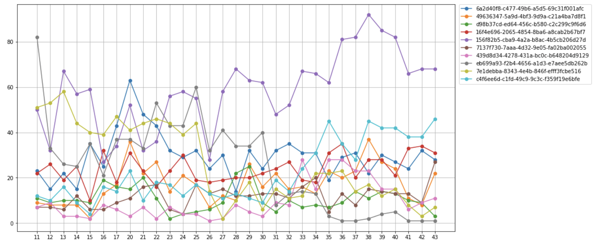
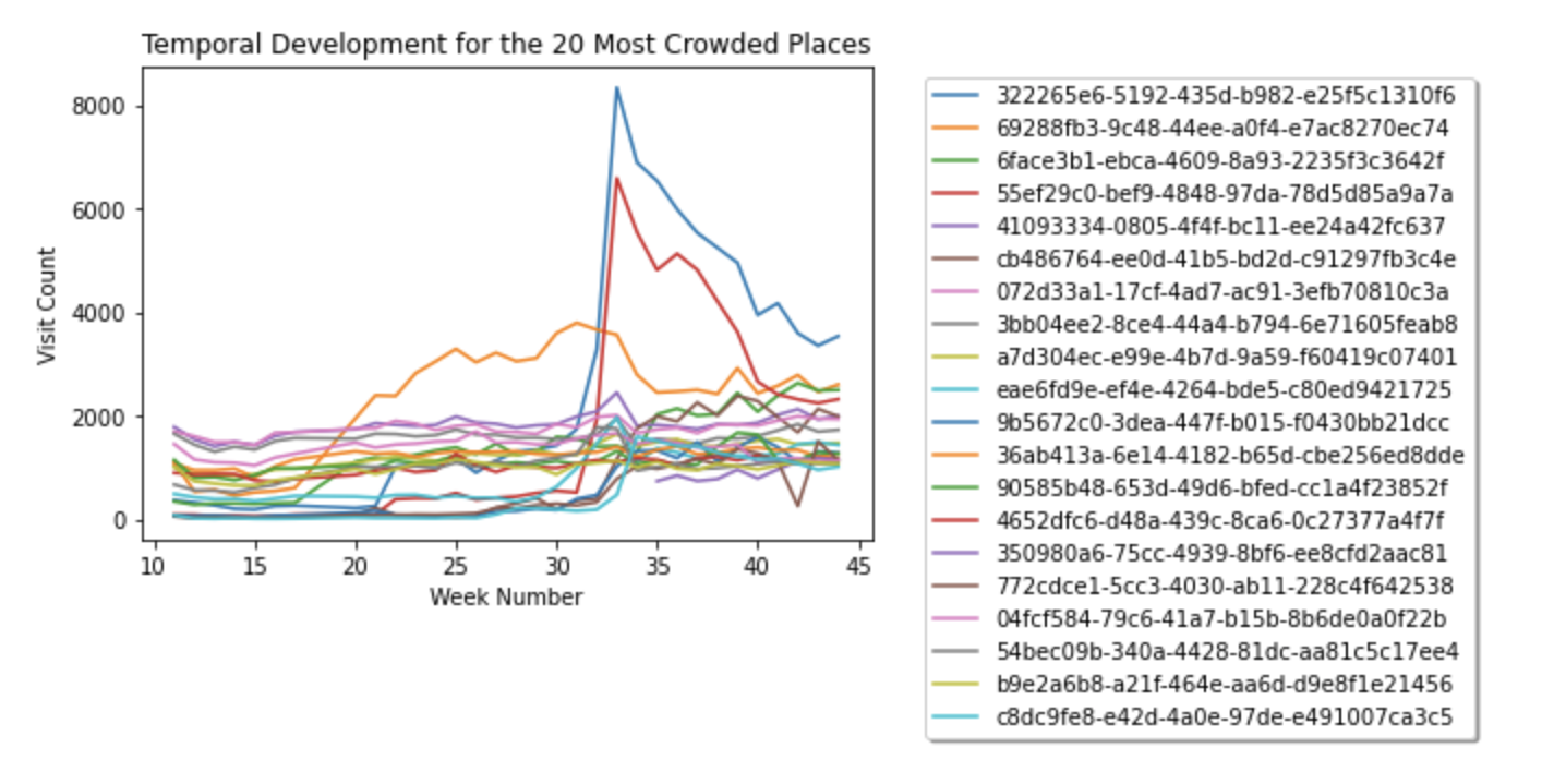 Chart: Present the temporal development of the 20 places with the greatest “increase” of foot traffic from week 40 to 44
View the notebook here
3rd Place Winner Solution
 heatmap
From the data exploration phase, I found that the peak for the number of visits are caused by Purdue’s fall semester start. The number of total visit counts has increased exponentially during the weeks leading to the starting of semester. After school started, the number of visits started to decrease at a constant pace. So, I’d advise the committee to take the most precaution during 1 to 2 weeks prior to school starting this spring semester, and gradually take less precaution as the weeks go on.
View the notebook here
4th Place Winner Solution
This notebook is to predict the behavior of social crowding in Tippecanoe county. The data provided contains week 11 to week 43 of each POI (Place of Interests) visit counts. Using the provided data to predict week 44’s visit count for each POI. In order to get the prediction result, here are the steps:
- Retrieve the data from the database and visualize the data which is interesting. The data visulization is done with:
- How many data in each week
- City distribution
- Post code distribution
- Top category distribution
- How many POIs in each week
- Start with the simple statistic model to do the prediction. Explore the univariate models prediction results at first. Extract poi_id, week_number, and raw_visit_count data and put into one csv file for further use. Train the univariate models and calculate the MSE score base on week 43 data. The models selected are as follows:
- Autoregression (AR)
- Moving Average (MA)
- Autoregressive Moving-Average (ARMA)
- Autoregressive Integrated Moving Average (ARIMA)
- Seasonal Autoregressive Integrated Moving-Average (SARIMA)
- Simple Exponential Smoothing (SES)
- Holt Winter’s Exponential Smoothing (HWES)
- Holt’s exponential smoothing (HOLT)
- Use auto_arima to automatic select univariate models for each POI
- Then, try the time series model LSTM to predict.
- Univariate LSTM
- Multivariate LSTM
 visitcount
- Linear models and ensemble model are also used to predict
- Average model
- Linear regression
- Support vector machine
- KNN
- Random forest
- Next, a CNN model is used to predict, the CNN model is consists of:
- An input layer
- An convolution layer (ReLU)
- A flattern layer
- A dense layer (ReLU)
- An output layer
- All the model predictions results are evaluated with MAE (Mean absolute error) value for week 43’s data
The final model selected is a univariate CNN model which has a MAE of 9.2.
View the notebook here
5th Place Winner Solution
Based on the results of the analysis, it is apparent that some locations are responding well to precventive measures while some others are recording an upsurge in the number of cases. A notable instance is Purdue University Main Campus in the first plot, the weekly cases recorded at the beginning of fall 2020 peaked at about 8000 which reduced to about 3000 cases per week and can be attributed to the adherence to the Protect Purdue pledge. The curve for Purdue University also correspondinly reduced. These are classic illustrations that simple measure such as masking up, washing hands, social distancing can indeed help flatten the curve. The second charts illutrated that supermarkets are some of the places that recorded the highest increase in the number of cases; this needs to be monitored. CBGs around Mike Raisor and Bob Automative group are some of the most crowded areas where policy change efforts should be focused. In conclusion, visual cues can be obtained from the charts and maps to guage the performance of the previously used policies andplan further. The Purdue case however affirmaively shows that the simple measures are indeed effective in curbing the spread of the virus.
View the notebook here
Check out more about the hack here.